
See How Your Services Connect — Introducing Services in OpsPilot
When something goes wrong in a distributed system, the hardest part isn’t fixing it – it’s knowing where to look. Is it the service that threw the error, or something upstream that caused it?
The new Services section in OpsPilot gives you the answer at a glance.It is designed to solve the “context tax” of distributed systems by providing a high-level visual map coupled with deep-dive diagnostic capabilities.
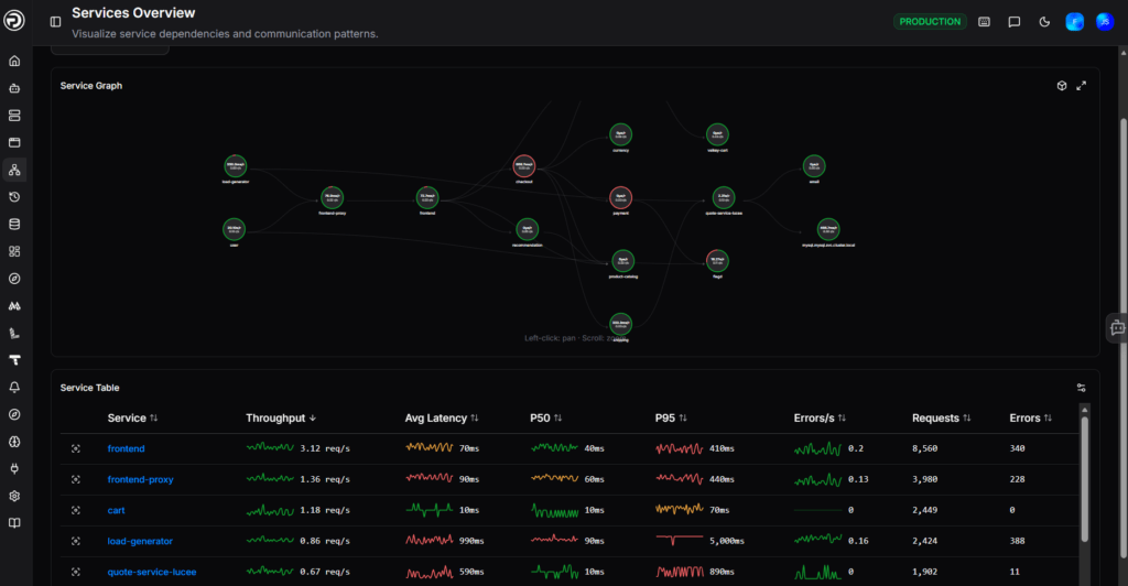
1. The Service Graph: Your System Map
Powered by OpenTelemetry, the Service Graph visualizes every instrumented service in your environment and the connections between them. Each node shows live latency and request rate, color-coded by health – so you can see at a glance which services are struggling and how the problem is spreading.
Instead of hunting through lists of names, the Service Graph provides a visual topology of how your services interact.
- Powered by OpenTelemetry: It automatically discovers and maps connections between any instrumented services.
- Live Health Status: Nodes are color-coded based on health, allowing you to see instantly if a failure in one service is cascading to others.
- Instant Metrics: Each node displays live latency and request rates directly on the graph.
2. Rapid Drill-Down
Click any service in the table, and you’re straight into a detailed breakdown: average and P95 latency, span status, top endpoints by throughput, log rate, and the specific operations generating errors. No hunting across dashboards — it’s all in one place.
You can instantly view:
- Latency Metrics: Average and P95 latency trends.
- Span Status: Success vs. error rates for specific operations.
- Throughput: Identification of top endpoints by request volume.
Error Context: Direct access to the specific operations generating errors, eliminating the need to cross-reference multiple dashboards.

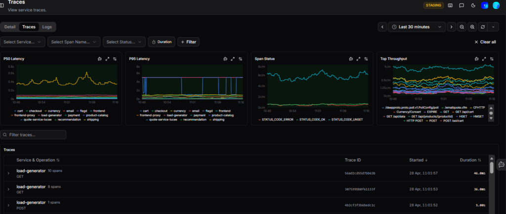
3. Integrated Traces and Logs
Switch tabs to see every individual trace for that service, filterable by operation, status, and duration. Or jump to Logs to see the full output with severity filtering and a rate chart to spot spikes the moment they happen.
The view bridges the gap between high-level symptoms and root-cause evidence:
- Scoped Traces: Switch to the “Traces” tab to see individual requests for that specific service. You can filter by duration, operation, or error status to find the exact “needle in the haystack.”
Contextual Logs: The “Logs” tab shows the full service output, including a rate chart to help you correlate log spikes with performance dips or errors.
How to Get Started
Because this system is built on OpenTelemetry, it is designed to be “zero-config” for teams already using OTel standards.
- Navigation: Go to the Services section in the OpsPilot navigation bar.
- Setup: If your services are already instrumented, they will appear automatically.
Documentation: For more technical details, you can visit the OpsPilot Documentation.