
The 7 Patterns Behind 95% of Production Failures — And Why Most Observability Stacks Still Miss Them
Here is something that should be more widely known.
After analysing thousands of production incidents across hundreds of engineering teams over two decades, the data shows the same result every time: the overwhelming majority of production failures are not novel. They are not exotic. They do not require brilliant detective work to resolve.
They are the same seven problems, repeating endlessly across different teams, stacks, and years.
95% of production failures follow one of these seven patterns. The other five percent are genuinely unusual. But teams spend most of their incident response time treating all failures as if they belong in that five percent — investigating from scratch, manually, every time.
That is the waste. That is the gap. And that is what this post is about.
Why The Same Production Failure Patterns Keep Repeating
Before getting into the patterns themselves, it is worth understanding why they repeat at all.
The answer is structural. Modern production systems share the same architectural building blocks — databases, connection pools, caches, queues, service dependencies, deployment pipelines — and those building blocks fail in the same ways regardless of who built the system or which language it runs in.
The specific service name changes. The stack changes. The team changes. The failure mode does not.
This is actually good news, because it means production failures are largely predictable. The patterns are known. The signals are detectable. The fixes are well-understood. The only thing missing, for most teams, is the layer that connects the incoming telemetry to the known pattern automatically — instead of requiring an engineer to make that connection manually at 2am.
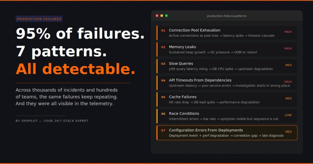
The 7 Production Failure Patterns
Pattern 1: Connection Pool Exhaustion
What happens: A service runs out of available database connections. Requests start queuing. Latency spikes. Timeouts follow.
What the dashboard shows: High latency on the affected service. Possibly timeout errors. Nothing that points directly at connection pool state unless you know to look there.
What actually caused it: Traffic exceeded the configured pool size. Often this happens gradually over weeks as load grows, then tips into failure at a peak moment. The pool size was set at deployment and never reviewed.
Why does it take so long to find: Engineers see latency and start looking at query performance, service code, and network conditions. The connection pool is several hops away from the obvious symptoms. Without a layer that automatically correlates pool exhaustion signals with latency increases, it gets found last.
Detection signal: Active connections at or near pool maximum, sustained over time, correlated with latency increase on dependent services.
Pattern 2: Memory Leaks
What happens: A service accumulates memory over time without releasing it. Performance degrades gradually. Eventually the service crashes or becomes unresponsive.
What the dashboard shows: Memory trending upward over days or weeks. On a per-hour view it looks fine. On a per-day view the trend is obvious. Most teams look at per-hour views during incidents, by which point the trend has been visible for days.
What actually caused it: A reference is held somewhere it shouldn’t be. Common culprits are event listeners not being removed, caches growing without bounds, or connection objects not being properly closed.
Why does it take so long to find: Memory leaks are a slow-burning failure. By the time the incident fires, the memory graph has been showing the trend for 72 hours. If nothing were continuously monitoring that trend and correlating it with heap metrics and GC behavior, the connection wouldn’t be obvious.
Detection signal: Sustained memory growth trend over 24+ hours, increasing GC pressure, correlation with specific transaction types or endpoints.
Pattern 3: Slow Queries
What happens: A database query that runs acceptably under normal load becomes the bottleneck under higher load. Response times increase. Database CPU spikes. The effect cascades upstream.
What the dashboard shows: Service latency is increasing. Database CPU elevated. This is one of the more visible patterns — but the specific query causing the problem is buried in database metrics that most engineers don’t check first.
What actually caused it: A query missing an index, or a query that does a full table scan, or a query whose execution plan changed as the table grew. Often introduced with a deployment, sometimes visible for weeks before it becomes critical.
Why does it take so long to find: Engineers see service latency and check service code first. The database is treated as a dependency rather than a suspect. Slow query logs exist but aren’t typically surfaced automatically during a service incident.
Detection signal: Increasing p95/p99 query latency on specific query patterns, correlated with service response time degradation and database CPU.
Want OpsPilot to surface these patterns in your stack automatically? No manual investigation required. Start your free trial at app.opspilot.com/sign-up
Pattern 4: API Timeouts From Upstream Dependencies
What happens: A service your application depends on starts responding slowly or not at all. Your service starts timing out waiting for responses. Your users see errors that look like they’re coming from your service.
What the dashboard shows: Error rates increasing on your service. Latency increasing. The service looks like it’s the problem. The actual problem is one hop away.
What actually caused it: The upstream dependency degraded — throttling, its own incident, a deployment on their side, network issues between your service and theirs.
Why does it take so long to find: The symptoms appear on your service, so that’s where the investigation starts. Distributed tracing would show upstream latency immediately, but only if the traces are complete end-to-end. Most teams have incomplete trace coverage — a gap that often goes undetected until an incident like this exposes it.
Detection signal: Outbound request latency from your service to specific dependencies increases, correlated with your service’s error rate, while internal processing time remains normal.
Pattern 5: Cache Failures
What happens: A cache layer fails silently, starts evicting aggressively, or returns stale data. Traffic that was being served from cache now hits the database directly. The database load spikes suddenly.
What the dashboard shows: Database load spike. Service latency is increasing. Cache hit rate dropping — but cache metrics are often on a separate dashboard that nobody checks during a database incident.
What actually caused it: Cache memory pressure, a TTL misconfiguration, a cache cluster restart, or an edge case in cache invalidation logic introduced with a recent deployment.
Why does it take so long to find? The database spike draws all the attention. Engineers start looking at queries, connections, and load patterns. The drop in cache hit rate is the signal, but it’s on a different screen. Without simultaneous correlation between the two signals, the connection takes time to form.
Detection signal: Cache hit rate dropping correlated with database connection count and CPU spike, with stable application code metrics.
Pattern 6: Race Conditions
What happens: Two concurrent processes interact in a sequence that produces unexpected results. Data corruption, duplicate processing, or intermittent failures occur at unpredictable intervals.
What the dashboard shows: Intermittent errors. Low rate, inconsistent timing, no obvious pattern. The kind of alert that gets acknowledged and ignored until it gets worse.
What actually caused it: Shared state being accessed without proper locking, or distributed operations assuming a sequence that isn’t guaranteed under concurrency.
Why does it take so long to find: Race conditions are the hardest failure mode to diagnose because the logs show the symptom but not the sequence. The events that caused the failure occurred in the milliseconds before the error was logged, often across multiple services, and the standard log view doesn’t automatically reconstruct the sequence.
Detection signal: Intermittent errors at a low rate correlated across multiple services with specific transaction types, distributed trace analysis showing request interleaving patterns.
Pattern 7: Configuration Errors From Deployments
What happens: A deployment introduces a configuration change — an environment variable, a feature flag, a timeout value, a connection string — that degrades performance in a non-obvious way.
What the dashboard shows: Performance degradation or error rate increase starting at a specific time. The deployment event is in the timeline. The connection between the deployment and the degradation requires someone to look at both simultaneously.
What actually caused it: A value that was correct in staging is wrong in production. A timeout that was acceptable for small payloads breaks under real load. A feature flag that enables a code path that hasn’t been properly load tested.
Why does it take so long to find: Deployment events and performance metrics are often in separate systems. Engineers investigating performance issues start with the metrics. The deployment context is a different view. Without automatically correlating deployment events with performance signals, the timeline connection is made late.
Detection signal: Performance degradation correlated with deployment events in the same time window, with stable infrastructure metrics confirming the issue is application-level.
The Common Thread Across All Seven
Look at those patterns together, and one thing stands out.
In every case, the data that would have identified the failure faster — or prevented it entirely — was already in the observability stack. The connection pool metrics were there. The memory trend was visible. The query latency was in the database logs. The deployment event was recorded.
The production failure patterns were detectable. They just weren’t detected.
Because detection requires someone to correlate signals across multiple systems, on the right timescale, in the right combination. Under normal operating conditions, that doesn’t happen continuously. It happens reactively, after the incident occurs, by an engineer already under pressure.
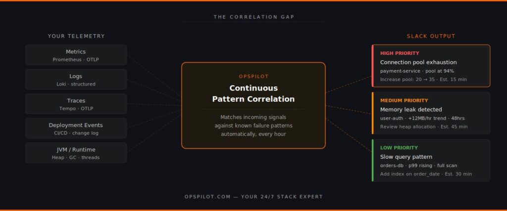
This is the observability gap that matters in 2026. Not the data gap. The correlation gap.
Why Most Observability Stacks Miss These Patterns
Standard observability tooling — even good tooling — is not built to surface production failure patterns automatically. It is built to make data available. The correlation is left to the engineer.
This is the right design for a visualisation tool. It becomes a problem when the visualisation tool is also expected to function as an analysis layer.
The distinction matters. A dashboard shows you that latency is high. An analysis layer tells you that the latency is high because the connection pool on the payment service has been at 94% utilisation for the last 40 minutes, which matches the pattern of connection pool exhaustion, and the recommended action is to increase the pool size from 20 to 35 connections, which has resolved this pattern in similar systems.
Those are different things. Most teams have the first. Very few have the second.
What Changes When Patterns Are Detected Automatically
Teams that have added continuous pattern detection to their observability stacks report the same outcomes.
Incident response time drops because the correlation work is done before the engineer opens a single dashboard. The recommendation arrives in Slack with the pattern identified, the affected component named, and the action specified.
Proactive detection increases because the pattern analysis runs continuously — not just when an incident fires. Memory leak trends get caught on day two rather than day eight. Connection pool utilisation gets flagged at 80% rather than 100%.
Observability gaps get found because pattern detection requires complete telemetry coverage. When a pattern can’t be fully evaluated because trace data is missing or a metric isn’t being collected, that gap surfaces as a recommendation. Most teams discover instrumentation gaps they didn’t know existed.
OpsPilot is built specifically to surface these seven production failure patterns — and others — automatically, from your existing OpenTelemetry data, delivered to Slack on your schedule. No new instrumentation required for teams already on OTLP. No proprietary agents. No dashboards to check.
The patterns are known. The signals are in your data. The gap is the correlation layer that connects them.
FAQ
Why do the same production failure patterns keep repeating across different teams? Because modern production systems share the same architectural components — databases, caches, connection pools, service dependencies — and those components fail in consistent ways. The specific implementation varies but the failure modes are structurally the same.
How does OpsPilot detect these patterns? OpsPilot ingests your OpenTelemetry telemetry via OTLP and continuously correlates signals across metrics, logs, and traces. It matches incoming telemetry patterns against known failure signatures and surfaces the relevant pattern with a prioritized recommendation when a match is found — automatically, on your configured schedule.
Do I need to change my existing instrumentation to use OpsPilot? No. OpsPilot connects to your existing OpenTelemetry data via OTLP. If you’re already sending OTLP data, OpsPilot can start analyzing it immediately. The only requirement is that your services are instrumented with OpenTelemetry, which is already the case for most teams.
What if my production failure isn’t one of these seven patterns? OpsPilot analyses a broader set of patterns beyond these seven. These are the most common based on our analysis of thousands of production incidents across hundreds of engineering teams, but the platform continuously analyzes your telemetry for anomalies and deviations that don’t fit known patterns as well.
See which of these patterns are hiding in your stack right now.
OpsPilot is an AI-powered observability intelligence platform that continuously analyses your OpenTelemetry data and surfaces production failure patterns, prioritized recommendations, health scoring, and gap detection — directly to Slack. Built by APM engineers with two decades of APM experience.