
What 10 Million Production Incidents Taught Us About Why Observability Tools Keep Failing Engineering Teams
In 2026, engineering teams have access to more powerful observability tools than at any point in history. And yet the same conversation keeps happening every single day.
An alert fires. Someone opens a dashboard. Metrics are checked. Logs are trawled. Slack fills up with questions nobody can answer quickly. Forty-five minutes later — sometimes three hours later — the root cause is found. A fix is deployed. The post-mortem is written.
And then it happens again next week.
After two decades building APM tools and analysing more than 10 million production incidents, we’ve watched this cycle repeat itself across hundreds of engineering teams. The observability tools get better. The dashboards get more sophisticated. The data volumes get larger. And yet the cycle persists.
The reason isn’t what most people think.
The Problem Isn’t Your Observability Tools
When engineering teams struggle with production incidents, the instinct is to blame the observability tool. The dashboard isn’t showing the right metrics. The alerts are too noisy. The APM agent isn’t capturing enough data.
So teams switch tools. Or add more tools. Or instrument more services.
And the cycle continues.
Here’s what 10 million incidents actually taught us: the tools aren’t the problem. The gap between data and interpretation is.
Every mature engineering team we’ve worked with has good monitoring in place. They have Datadog, or New Relic, or Splunk. They have Grafana dashboards. They have OpenTelemetry instrumentation across their services. They have alerts configured for the metrics that matter.
What they don’t have is someone — or something — that looks at all of that data continuously and tells them what it actually means.
What We Saw In 10 Million Incidents
When you analyse production failures at scale, patterns emerge very quickly.
The first thing you notice is that the vast majority of incidents are not exotic. They’re not caused by obscure race conditions or novel architectural failures. They’re caused by the same problems, repeating across different teams and different stacks, year after year.
Here are the seven patterns that account for 95% of what we’ve seen:
- Connection pool exhaustion Services run out of available database connections under load. The symptoms look like slow response times or timeouts. The dashboards show high latency. The real cause — a connection pool that’s too small for actual traffic patterns — takes hours to find manually.
- Memory leaks Gradual memory growth that looks fine on a daily view but shows a clear trend over days or weeks. By the time it causes an incident it’s been visible in the data for a long time. Nobody spotted it because nobody was looking at the trend continuously.
- Slow queries A database query that performs acceptably at low volume becomes catastrophic at scale. The service metrics show degradation. The query is rarely the first place engineers look.
- API timeouts Upstream dependencies degrade and downstream services start timing out. The affected service looks like the problem. The actual problem is one hop away.
- Cache failures A cache layer fails silently or starts returning stale data. Traffic that was being absorbed by the cache hits the database directly. Load spikes. Latency rises. The cache is rarely the first suspect.
- Race conditions Intermittent failures that are almost impossible to reproduce in staging. The logs show the symptom but not the sequence of events that caused it. These are the incidents that take the longest to resolve — not because they’re complex, but because the data exists and nobody is correlating it correctly.
- Configuration errors A deployment introduces a configuration change that degrades performance in a non-obvious way. The timeline is right there in the deployment logs. The connection between the deployment and the degradation takes time to make manually.
The Common Thread
Look at that list carefully.
In every single case, the data that would have identified the problem faster — or prevented the incident entirely — was already there. In the metrics. In the logs. In the traces.
The problem wasn’t visibility. It was interpretation.
Engineering teams in 2026 are not short of observability data. They are drowning in it. The average mid-sized engineering team has hundreds of dashboards, thousands of metrics, and more alerts than any human being can meaningfully process.
What they’re short of is the layer that sits above all of that data and says: here is what matters, here is why it matters, and here is what you should do about it.
Want to know what patterns your current tools are missing? Try OpsPilot free — no credit card required. Start free today
Why Monitoring Tools Were Never Designed To Do This
This isn’t a criticism of observability tools. Datadog, Grafana, New Relic — these are genuinely excellent products that do exactly what they were designed to do.
The problem is what they were designed to do.
Monitoring tools were designed to collect data and make it visible. They show you what is happening in your system at any given moment. They alert you when a metric crosses a threshold. They give you dashboards that display the state of your services.
What they were not designed to do is tell you what to prioritise, what the data means in the context of your specific system, or what action you should take next.
That’s not a gap in their execution. It’s a gap in their design intent.
And for a long time, that gap was filled by senior engineers. The person who had been running the system for three years, who knew that a spike in that particular metric almost always meant a connection pool issue, who could look at a dashboard and immediately know where to look next.
The problem in 2026 is that those senior engineers are expensive, hard to hire, and impossible to scale. And the systems they’re being asked to monitor have grown far beyond what any individual can hold in their head.
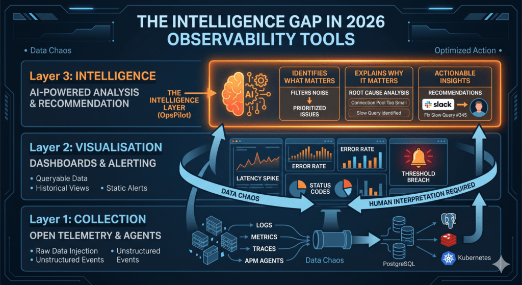
The Intelligence Gap
What the industry has built, over decades of excellent engineering, is a world-class data collection and visualisation infrastructure.
What it hasn’t built — until recently — is the intelligence layer that sits above that infrastructure and translates data into action.
Think of it in three layers:
Layer 1: Collection — OpenTelemetry, agents, exporters. Getting the data from your services into a central place. This problem is largely solved. OpenTelemetry is now the standard and it works.
Layer 2: Visualisation — Grafana, dashboards, alerting. Making the data visible and queryable. This problem is also largely solved. The tools are excellent.
Layer 3: Intelligence — The layer that continuously analyses the data from layers 1 and 2, identifies what matters, explains why it matters, and tells you what to do about it. This layer, for most engineering teams, doesn’t exist.
The absence of layer 3 is why engineering teams with excellent monitoring still spend 3 hours on root cause analysis. It’s why incidents that were visible in the data for days go undetected until they become outages. It’s why teams spend 10+ hours a week manually reviewing dashboards that should be reviewing themselves.
What Changes When The Intelligence Layer Exists
When we started building OpsPilot, we took everything we’d learned from 10 million incidents and asked a simple question: what would a genuinely expert DevOps engineer see in this data that a less experienced engineer would miss?
The answer was consistently the same things:
They would see trends before they became incidents. They would correlate signals across services that a human analyst would check separately. They would prioritize the three things that actually matter among the fifty alerts that fired. They would quantify the business impact of each issue so the team knew where to focus first.
And they would do all of this continuously — not once a week when someone has time to review the dashboards, but every hour, every day, on whatever schedule the team needed.
That’s what an intelligence layer does. Not replacing the engineers — augmenting them. Giving a 30-person team the analytical coverage that once required a dedicated senior SRE.
The Pattern We Keep Seeing In 2026
The teams that are winning operationally in 2026 are not the ones with the most sophisticated monitoring stacks. They’re not the ones with the most dashboards or the most alerts.
They’re the ones that have closed the intelligence gap.
They’ve stopped treating observability as a data collection problem and started treating it as an interpretation problem. They’ve stopped asking “do we have enough data?” and started asking “are we getting enough value from the data we already have?”
If you’re spending more than an hour a week manually reviewing dashboards, the answer to that second question is probably no.
The data is there. The tools are there. What’s missing is the layer that connects them to action.
That’s the lesson from 10 million incidents. And it’s the problem we built OpsPilot to solve.
See what OpsPilot finds in your stack — free trial, no credit card required.
OpsPilot is an AI-powered observability intelligence platform that continuously analyses your OpenTelemetry data and delivers prioritized recommendations, health scoring, and gap detection — directly to Slack. Built by APM engineers with 20 years of experience.