
Dashboards Show You What Happened. This Is What Tells You What To Do Next.
Dashboards are not the problem.
This is important to say clearly at the start, because the argument that follows could be misread as an attack on the tools that most engineering teams depend on. It isn’t. Grafana is excellent. Datadog’s dashboards are excellent. The visualisation layer of modern observability tooling has been built with genuine care and considerable engineering skill.
The problem is not the dashboard. The problem is the question the dashboard was designed to answer.
A dashboard answers one question: what is happening right now? Or, in the case of historical views, what happened? It does this well. It displays the state of your system in a way that a human can interpret — lines going up or down, numbers in red or green, alerts firing or not firing.
What it was never designed to answer is the question that matters most when something goes wrong, or when you’re trying to prevent something from going wrong:
What should we do next?
The Question Dashboards Cannot Answer
The gap between “what happened” and “what to do next” is where observability action 2026 lives — and where most engineering teams are still operating entirely manually.
Here is what that gap looks like in practice.
An alert fires. An engineer opens a dashboard. The dashboard shows elevated latency on a service. The engineer looks at the graph. The graph confirms that yes, latency is elevated. It has been elevated for about 40 minutes.
The dashboard has answered “what happened.” Latency increased 40 minutes ago on this service.
What the dashboard cannot tell the engineer is:
Why the latency increased. Which component in the dependency chain is causing it. Whether this matches a pattern the team has seen before. What the business impact is if it continues. How urgent it is relative to three other things also demanding attention. What action would resolve it and how long that action would take.
All of those are “what to do next” questions. None of them are answered by a graph.
An engineer who knows the system well can work through those questions quickly — drawing on experience, intuition, and familiarity with the service’s typical failure modes. An engineer who is less familiar, or who is responding at 2am to a service they don’t own, will work through them slowly.
Either way, the work is manual. The dashboard is a starting point, not an answer.
Why Dashboard Fatigue Is A Symptom, Not The Problem
Dashboard fatigue — the state of being so overwhelmed by monitoring dashboards that you stop engaging with them meaningfully — is widely discussed in engineering teams. It is real. But it is a symptom of a deeper structural issue, not the problem itself.
Teams accumulate dashboards because dashboards feel like progress. Every time a new service gets instrumented, a new dashboard gets built. Every time an incident surfaces a gap in visibility, a new panel gets added. Over time, a team that started with three dashboards has thirty. Most of them are never checked except during incidents.
The fatigue is not caused by having too many dashboards. It is caused by the fact that checking dashboards is not an efficient use of engineering time, and engineers — consciously or not — recognise this and disengage.
Checking a dashboard requires an engineer to mentally compare current state against expected state, identify anomalies, assess their significance, and decide what to do. This is cognitive work. Doing it across thirty dashboards, several times a day, is exhausting and largely unrewarding because most of what you see on most dashboards most of the time is normal.
As we covered in The Intelligence Gap in Observability: Why More Data Isn’t The Answer, the answer to this problem is not fewer dashboards or better dashboards. It is a layer that does the comparison, anomaly identification, and significance assessment automatically — and only surfaces the result when there is something worth acting on.
Ready to move beyond dashboards to prioritised action? Start your free trial at app.opspilot.com/sign-up — no credit card required.
What Observability Action 2026 Actually Looks Like
The teams that have moved beyond reactive dashboard monitoring to genuine observability action in 2026 are not the teams that built better dashboards. They are the teams that stopped treating dashboards as the primary interface between their stack and their engineers.
The shift is from pull to push.
A dashboard is a pull interface. The engineer goes to the dashboard and pulls information from it. This requires the engineer to know what to look for, when to look, and how to interpret what they see.
Observability action is a push model. Analysis runs continuously. When something worth acting on is identified — a pattern that precedes a failure, a cost anomaly, an instrumentation gap, a degrading trend — a recommendation is pushed to the engineer in the channel they’re already in, on the schedule the team has configured.
The engineer doesn’t need to know when to check. The system tells them when there is something worth checking. And it doesn’t tell them “check the latency dashboard” — it tells them “the connection pool on payment-service is trending toward exhaustion, here is the recommended action, here is the estimated effort, here is what happens if you don’t act.”
That is the difference between visibility and action.
The Three Questions That Separate Visibility From Action
Every meaningful observability interaction boils down to three questions. Dashboards answer the first. Observability action answers all three.
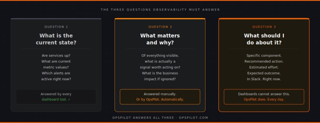
Question 1: What is the current state of my system?
This is the dashboard question. Every monitoring tool in existence answers it. The state of services, the current metric values, the active alerts — this is well-served by existing tooling. It is necessary but not sufficient.
Question 2: What matters and why?
This is the question that separates good observability from excellent observability. Of everything visible in the current state, what is actually significant? What is a genuine signal worth acting on, versus noise that can be safely ignored? What is the business impact of the things that matter?
Answering this question manually requires experience, familiarity with the system, and time. Answering it automatically requires an intelligence layer that understands normal behaviour patterns, knows how to distinguish signal from noise, and can quantify business impact.
Most teams answer this question manually when they answer it at all. Teams running continuous automated analysis have it answered for them, continuously, before they need to ask.
Question 3: What should I do about it?
This is the action question. The practical next step. The specific component to address, the recommended change, the estimated effort, the expected outcome. This question turns observability from information into work.
A dashboard cannot answer this question. A prioritized recommendation delivered to Slack can.
As we described in “Your Observability Stack Is Missing Layer 3,” the intelligence layer answers questions 2 and 3. Without it, every time an alert fires, an engineer has to answer those questions manually from scratch. With it, the answers arrive before the engineer needs to ask.
The Cost Of Operating On Dashboards Alone
The cost of operating purely in dashboard mode — waiting for alerts, investigating manually, answering “what to do next” from scratch every time — is real and measurable.
Time cost. As we explored in Why Does Root Cause Still Take 3 Hours?, the average root cause analysis takes between two and four hours even with good tooling. The majority of that time is spent on questions 2 and 3 — significance assessment and action identification — work that could be substantially automated.
Opportunity cost. Every hour an engineer spends manually reviewing dashboards or investigating an incident is an hour not spent on product work. For a team of 30 engineers spending a combined 10 hours per week on manual observability work, that is a quarter of one engineer’s productive time, every week, consumed by work that should not require human attention.
Detection cost. Reactive dashboard monitoring means problems are detected when they become visible — when a metric crosses an alert threshold. An intelligence layer that analyses trends continuously detects the same problems days earlier, when the pattern is forming rather than when it has already caused impact. The cost of that detection gap, compounded across all the incidents that could have been caught earlier, is significant.
Coverage cost. Engineers checking dashboards check the dashboards they know to check. Instrumentation gaps — services or trace paths not covered by dashboards — are invisible until an incident exposes them. Continuous coverage analysis, as described in See How Your Services Connect, finds these gaps proactively.
What The Shift To Observability Action Requires
Moving from dashboard-centric observability to observability action does not require replacing your existing tooling.
Grafana stays. Your dashboards stay. Your alerting stays. The shift adds a layer above them — a continuous analysis layer that reads the same data your dashboards are reading, but produces recommendations rather than visualisations.
The practical requirements are:
Existing OpenTelemetry instrumentation. If your services are sending metrics, logs, and traces via OTLP — which most modern services are — the data required for continuous analysis is already flowing. As we covered in You’ve Instrumented Everything With OpenTelemetry. Now What? The instrumentation question is largely answered for most teams. The intelligence question is what remains.
A Slack channel. OpsPilot delivers recommendations to the channel your team is already in. No new interface to learn. No new dashboard to check. The recommendations arrive in the flow of work.
A configured schedule. Daily, hourly, or on whatever cadence fits the team’s workflow. The analysis runs on your schedule, not on the incident schedule.
The output — prioritized recommendations with specific actions, effort estimates, and business impact — replaces the manual work of answering questions 2 and 3 every time an alert fires or an engineer sits down to review dashboards.
The Practical Difference
Here is the same incident, handled two ways.
Dashboard mode: Alert fires at 02:14. Engineer is paged. Engineer opens monitoring tool, reviews service health dashboard, checks latency graphs, examines error rates, opens trace explorer, follows dependency chain, identifies connection pool exhaustion as probable cause after 90 minutes, confirms, applies fix at 03:52. Total incident duration: 98 minutes.
Observability action mode: OpsPilot’s 06:00 UTC analysis three days earlier identified that the connection pool on payment-service was trending toward saturation and delivered a recommendation to Slack: “Connection pool approaching limit — increase pool size from 20 to 35. Estimated effort: 15 minutes. Risk: service timeout at next traffic peak.” The engineer acts on the recommendation during business hours. Alert at 02:14 never fires. Total incident duration: zero.
Both scenarios had identical telemetry data available. One used it reactively. One used it proactively. As explored in How AI-Powered Observability Solved a Complex Microservices Mystery in Minutes, the difference is not the data — it is the layer that interprets it continuously.
The Dashboard Is Not Going Away
To be clear about what observability action 2026 does and does not mean: dashboards remain valuable.
When an incident does fire — when something needs immediate investigation — the dashboard is still the right tool for real-time situational awareness. When an engineer wants to explore the behaviour of a specific service in detail, the dashboard is the right interface. When leadership wants a high-level view of system health, the dashboard is the right display.
The intelligence layer does not replace dashboards. It answers the questions dashboards cannot answer, so that engineers spend less time going to dashboards looking for problems and more time responding to recommendations that tell them exactly what the problem is and what to do about it.
Dashboards show you what happened.
OpsPilot tells you what to do next.
FAQ
Does moving to an observability action model mean we lose visibility? No. OpsPilot sits alongside your existing dashboards and alerting. Your Grafana instance, your Datadog dashboards, your PagerDuty routing — all of these continue to work exactly as before. OpsPilot adds the action layer on top of the same data, pushing prioritised recommendations to Slack. You retain full visibility and gain the action layer.
What if we have a lot of custom dashboards we’ve built over time? They stay. OpsPilot doesn’t interact with your dashboard configuration. It connects to your OpenTelemetry data via OTLP and analyses independently. The custom dashboards your team relies on for investigation remain available. The difference is that you spend less time going to them looking for problems because the problems surface automatically.
How does OpsPilot know what a normal state looks like for our system? OpsPilot establishes baselines over the first week of operation by analysing your telemetry data and learning your service’s normal behaviour patterns — typical latency ranges, usual error rates, expected resource utilisation. Recommendations are generated based on deviations from these established baselines, which means the system understands what “normal” looks like for your specific traffic patterns rather than applying generic thresholds.
Will the Slack recommendations create their own form of alert fatigue? This is a fair concern and the design of OpsPilot addresses it directly. Recommendations are prioritised HIGH, MEDIUM, or LOW with clear business impact stated. The volume is kept low by design — the goal is to surface the three things worth acting on, not to send a notification for every anomaly. Teams configure the frequency and types of analysis to match their workflow, so the digest cadence fits around the team rather than demanding constant attention.

Your dashboards show you what happened. OpsPilot tells you what to do next.
OpsPilot is an AI-powered observability intelligence platform that continuously analyses your OpenTelemetry data and delivers prioritised recommendations, health scoring, and gap detection — directly to your team. Built by APM engineers with two decades of experience.